

In the midst of a brand merger and identity change, Providence approached VMLY&R to be their first partner to unify the Providence and St. Joseph Health brands, redefine the customer journey, give the newly unified brand a modern design refresh, and increase appointment booking leads on their site.
Our XD team began by auditing wireframes originally created by Providence’s internal team. Our user-centered recommendations led to a series of workshops to quickly uncover personas, visitor journeys, and underlying customer needs.
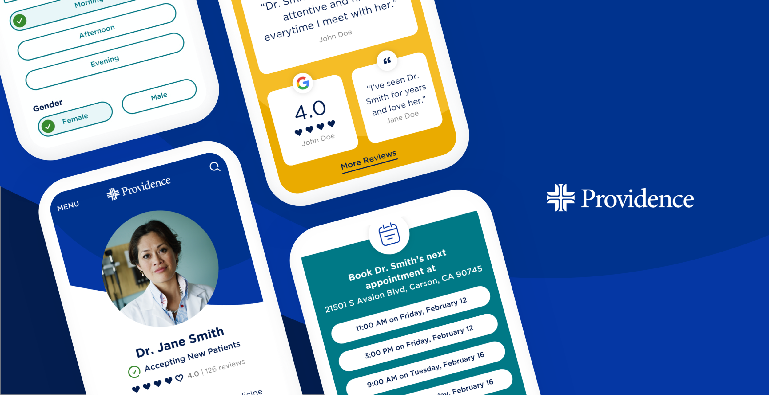
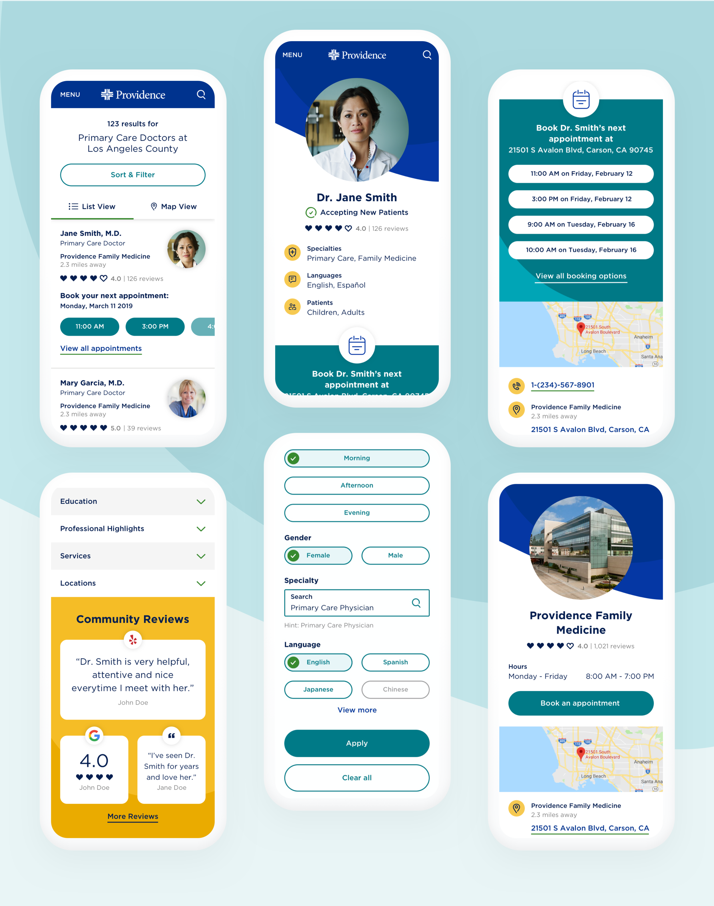
Following our workshops, our UX team proceeded with wireframes; primarily focusing on finding a doctor and the booking experience. My UI team began working with Providence to define a new visual direction for the unified brands. Visually, we thought it was important for legacy St. Joseph patients to find something familiar in the newly merged experiences. Oh, and did I mention that they didn’t even have a new logo yet? The amount of trust they placed in us was refreshing but WILD.
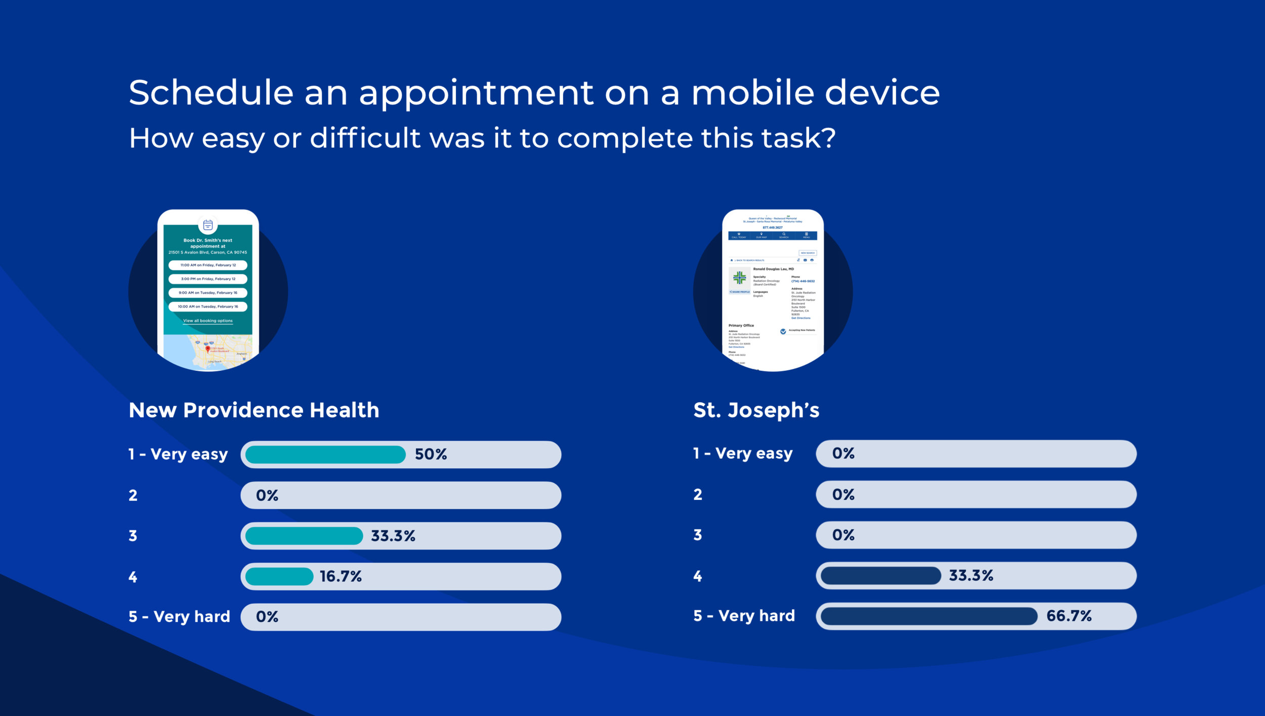
As we finalized the design, we ran a series of focus groups to measure the new site against the old experience. We tested five critical site actions and in each case our new site significantly outperformed the legacy platform.
For example, on the task of "scheduling an appointment," which was our primary KPI, users scored the new design as “Very Easy” when asked to rate ease of use. The old site scored “Very Difficult” in that category.